When starting a new project, there is always a question about the approach. You spend a lot of time figuring out whom you are designing for and where to meet them. How should you approach the users and what do they need? What design approach should you choose?
A few years ago, most designers approached the desktop side of a project first. You begin with the full-size site and work your way down. But what if you flip this workflow?
In 2016 mobile internet usage exceeded desktop usage. The substantial increase force designers to pay more attention to the mobile platform and follow the “mobile first” rule in product design.
What Is «Mobile First»?
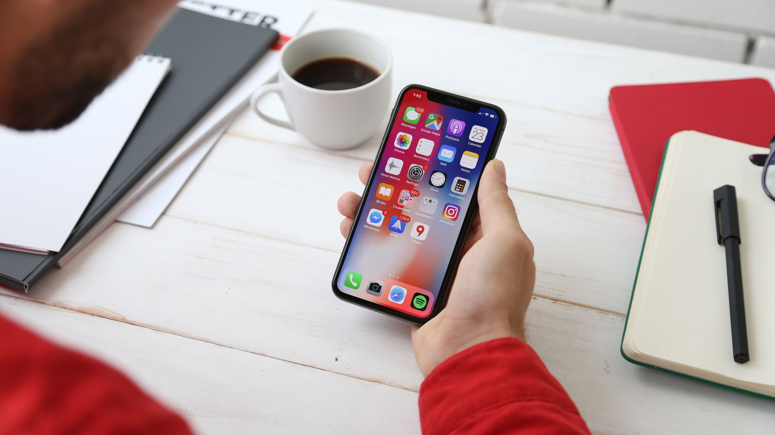
The «mobile first» approach is exactly as it sounds: designing for the smallest screen first and working your way up. When starting the product design from a “mobile first” viewpoint, there are more restrictions. This forces you to focus on the essentials before you expand its features to create a tablet or desktop version.
The “mobile first” approach organically leads to a design that’s more content-focused, and therefore user-focused. The heart of the site is content — that’s what the users are there for.
Still, it’s essential to keep in mind that mobile users sometimes require different content than desktop users. Device-specific content can be measured by considering context — what will your user appreciate more and what do they need?
With a «mobile first» viewpoint, we start by inserting the absolute bare essentials on the smaller platforms. The «mobile first» design doesn’t mean changing your entire process. Instead, it means reimagining how we create content while keeping a firm focus on mobile users’ needs.
Progressive Advancement vs. Graceful Degradation
In order to make web or application interface display reasonably on different devices, designers provide customised versions for different screens. The two concepts «Progressive Advancement» and «Graceful Degradation» can lend a lot of insight into the idea of «mobile first” design and why it’s an important concept to consider.
«Graceful Degradation» starts the product design from an advanced end like desktop and builds a version with well-rounded features at the beginning. Then designers make the product compatible with mobile ends by cutting some functions or contents.
The opposite approach is «Progressive Advancement». This means that when we design a product, we first build a version for the relatively lower browser (like that on a mobile phone), which include the most basic functions and features. After that, we tend to the advanced version for a tablet or desktop, which is created by adding interactions, more complicated effects, etc. on the basic version for better user experience.
Why “Mobile First”?
When you start with the desktop platform, you tend to take advantage of everything that the platform has to offer. You build an amazing product that leverages lots of great technology, only to realise that none of it scales well down to mobile. Mobile has the most limitations, foremost the screen size, and so designing within the mobile parameters forces you to prioritise content and functionality. This can lead to a mobile product that feels watered-down rather than a polished, finished product.
If we examine the progressive enhancement workflow, the result tends to be a different story. You’ve taken all of that starting energy and put it into creating a product that looks and functions well despite the many restraints that you faced. More importantly, you’ve already gone through the problem of trimming down the content to its most vital elements. Now when it’s time to bring this design to the desktop, instead of facing the decision of what to cut and how to water down your product, you instead get to decide how to make it even more robust.
What About «Desktop First»?
The desktop is still an important medium and designing for full-sized screens means building for the highest specs to display and communicate as much as possible. For instance, when your product is intended for use on a desktop, such as a productivity tool or business-related service. In this design, it’s not the mobile, but the desktop experience, that needs to be in focus.
A strong desktop design is ideal for feature-rich websites and applications targeting desktop users. As mentioned earlier, mobile users sometimes require different content than desktop users. Therefore, in a feature-rich website or application, some elements may not be needed in the mobile view. Going down to smaller resolutions (graceful degradation) you hide and wrap elements while trying to support as many original features as possible. In this case, the mobile experience is functional rather than refined. A feature-rich website depends on a strong desktop design, and with a «desktop first» approach you get to see the product how it should look.
Get help choosing the right approach for your company
In short, the «mobile first» principle has an important role in product design. It helps to save product design time and improve designers’ productivity. But it also forces designers to pay more attention to the content of a product, which helps them to create neat and practical designs. Google has also made it clear that «mobile first» is important, and this is also something to consider when choosing an approach. Obviously, the “desktop first” is still an important medium, not to be forgotten or pushed aside. «Mobile first» is an important approach to consider, but don’t let it get in the way of creativity!
In Gture, our designers use cutting edge technologies and approach to building the best sites and products for our customers. If you need help designing your dream pages, don’t hesitate to contact us at hello@gture.com.