
Designing for the user and focusing on their needs is more important than ever. As designers we see how this isn’t only recommended anymore, it is also expected. In a digital age, where everyone is online equals a diverse set of user groups. We have to make sure to design for good user experience, and to make it accessible for every user. This is called universal design.
What does this mean?
Universal design is to design products to make them accessible to all users, regardless of age, disability or other factors. This means not to limit the usage of an app or a website to users which are for example colorblind or old of age.
There are multiple ways to ensure good universal design. Some are to program or code in a way that makes it possible for the user to navigate despite being blind. The structural design also needs to be designed so the user knows how to use it. Making sure the user knows where to look, where to click or intuitively know how to use a product, all because its designed in a way that the user recognize from earlier experiences.
Last but not least, the design must be there to help the user. For example, the use of color cannot be the only way to distinguish something, you also need to use text or other indicators to visualize what you want to show. This is to ensure that users with visual disabilities clearly can see the changes.
Why is this important?
In most cases a product has a wide specter of possible users, which means we have to design for the masses and therefore making universal design extremely important. This means making sure the user can read an article even though you have bad eye sight and need bigger text size, or that the user knows where to find the “My profile” button because it’s in the same spot that you are used to on other sites.
Viewability may be the most important thing to have in focus. Since we make visual products, we need to make sure it is viewed the way we want. That’s making sure the text is large enough or that we use white space to help users focus.
5 to 8% of the male population is colorblind. This means that if you have a product with 1000 male users, up to 80 of them could have complications using the product if the design hasn’t taken this into account. When you have this many user that could have a problem with the use of color, we have to make sure to use a color combination that will give the same view to them as everyone else.

WCAG and technical accessibility
There are many different tools and guidelines to help us with universal design. WCAG is a standard developed by the organization W3C (World Wide Web Consortium). This has a set of criteria and guidelines to help make content more accessible to people. This is important to focus on since users can be very diverse, from small children to elderly or people with disabilities.
The newest version is WCAG 2.1, and it includes 78 success criteria on how to build an accessible website. It takes a lot of work to meet all criteria, and you have to make a lot of design choices based on accessibility rather that what might look “cool”.
WCAG also consist of guidelines for how the website is programmed. For example, how to help a blind person navigate with text-to-speech, what level of contrast a text color have relative to the background and lots more. They can be quite a challenge to learn, both from a technical perspective as well as a design perspective, but they are highly necessary to make sure the product is accessible.
Some of the criteria that are important when thinking of design is:
Success Criterion 1.4.1 Use of Color
Color is not used as the only visual means of conveying information, indicating an action, prompting a response, or distinguishing a visual element.
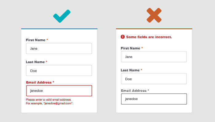
Success Criterion 3.3.1 Error indicator
If an input error is automatically detected, the item that is in error is identified and the error is described to the user in text.
Criteria 1.4.1 and 3.3.1 can be related together, since both is very important in e.g. the essential step of logging in. If color is used to tell something to the user, it is important to also use other elements to ensure this information is viewed by everyone. For example, an error message should not only be presented with the change to red color (1.4.1), a good fit here is to use a symbol like exclamation mark “!” and the use of text, “Error: Wrong password entered”. To make sure we also meet 3.3.1 we need to symbolize exactly where the error is.
A good way to use both is to mark the field that is wrongly entered with red color, text that says why the error occurred, and often a symbol to make sure the user knows what the problem is, where it is and how to fix it.
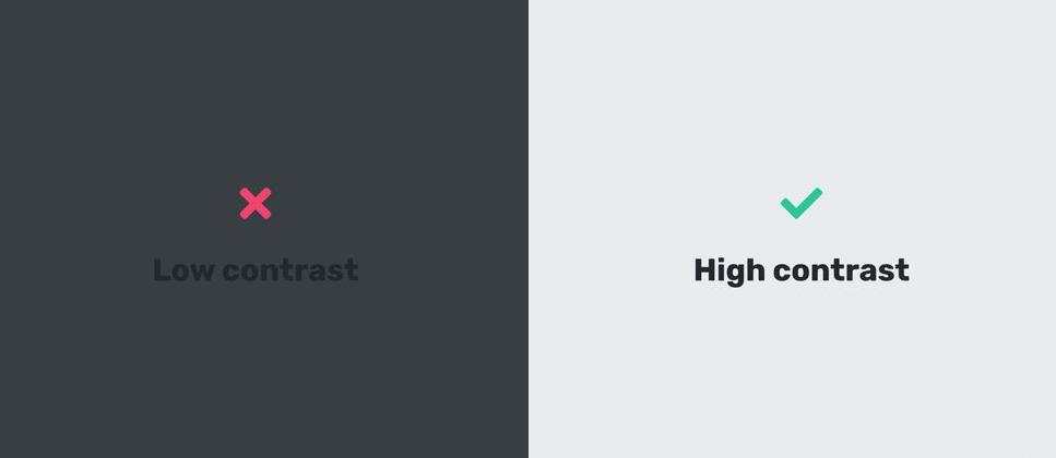
Success Criterion 1.4.3 Contrast (minimum)
The visual presentation of text and images of text has a contrast ratio of at least 4.5:1.
This is how readable the text is depending on the background and is especially important in the use of a colored background. You can easily check if you meet the contrast criteria by using a contrast checker. The normal black text on white (or white on black) is the best, with the score of 21:1.
Success Criterion 3.2.4 Consistent identification
Components that have the same functionality within a set of web pages are identified consistently.
Consistency in design is important to ensure the user don’t get confused. The design of two buttons that have the same usage should look the same. If the “Next page” button is round with the color blue on one page, it needs to look the same on all pages, and not change to green and rectangular on another page. If the change is too big the user may think it has a different purpose than the first one.
What we recommend
First of all, the WCAG standard is comprehensive and it requires a lot of work to meet all requirements. Therefore, we recommend start focusing on the minimum requirements when building a website and then continue to improve as you go along. If you are making a different type of digital product, most of the requirements is still necessary to have an accessible product.
Meeting all the guidelines is not easy, and it often has a cost for designers. In some cases, we have to limit some use of creative design choices to assure good usability. Fancy design and lots of color is not always welcome in the world of WCAG. In many ways this means holding back on excessive use of color and design elements. This of course depends on what target group you have, and what the content is, but it is important to set user experience first, and focus on what the user needs.
It’s a reason most apps and websites look similar, and that is because it works. Users already know how to use a menu bar at the top, or how something should look if its clickable. If the learning curve to use a product is too steep many users won’t use it, therefor we have to make sure the product is easy to learn. So, no matter how challenging it may be to meet the guidelines, the number one priority should always be to help the user fulfill its needs.
To wrap things up
In some products, WCAG is incredibly important to follow, because the target group is large and diverse. Here you also need to focus on the matter of technical accessibility, like text-to-speech or code that will help people with a disability to use the website. But there are also target groups where the rules are “ok” to break. For example, we often see that on an art museum website the user is expecting crazy colors and artistic design choices reflecting the art museum. So, always see WCAG in context with both users and concept.
Nevertheless, it’s important to not only think of design as something that only should be visual pleasing. Design should help the user. It should guide the user to do what it wants, but also do what you want, and this is why it is important to think of usability and accessibility in the process of making a product.